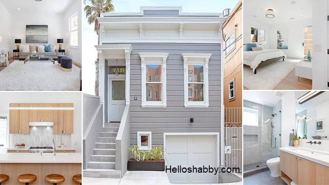
Helloshabby.com --Tiny house design proves that bigger isn't always better. Designing a house with a limited size does require you to be more creative in order to remain comfortable functionally. Tiny house is growing in popularity because it offers all the practicalities that you can enjoy directly.
Here we will share 7 tiny house plans that prove bigger isn't always better that you can use as a guideline!
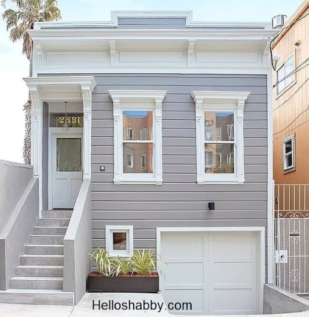
1. Facade of the house
The facade of the house is the outermost part of the house building. The attractive design of the facade of the house, will make a good impression for those who see it. Almost the entire wall looks elegant with a touch of gray. The combination of white color makes the appearance more charming and balanced.
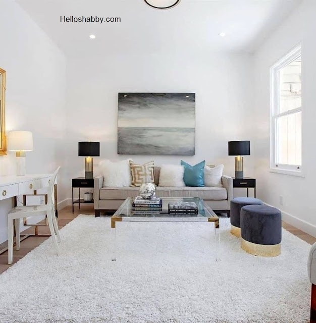
2. White living room design
All-white interior design never fails to make the look of the room more elegant. This narrow living room filled with beautiful shades of white. While some decorations, you can combine with neutral colors such as gray, and black for the look of a room that stands out.
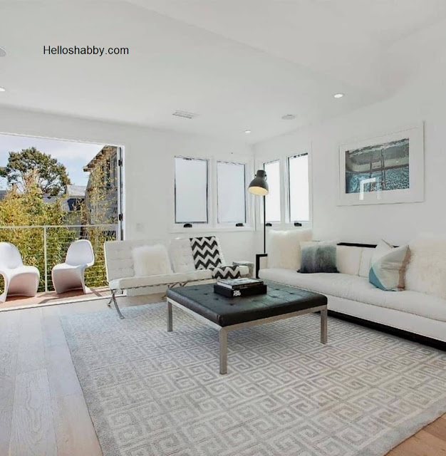
3. Using the concept of open space
Carrying the concept of open space with large window facilities allows the room to look wider. In addition, air circulation also runs well, which will make the tiny house healthier.
4. Kitchen with island table
The design of the kitchen equipped with an island table will make it easier for you while on the move. Not only can you use it for food preparation, you can use it as a functional dining room.
5. Elegant white bedroom
Carrying the concept of minimalism, this bedroom design made with simple design. Not many decorations used, so the room looks more relieved. The dominance of white makes the room look neater.
6. Natural lighting in the bathroom
When designing a small bathroom, there are several things you need to pay attention to. One of them ensures the room gets maximum natural lighting. That way, the room will look bright, and the room feels cooler.
7. Minimalist style kitchen
Minimalist style kitchen with wooden cabinets present a more homey home atmosphere. You can combine it with white for a cleaner kitchen look. That way, cooking activities will be more fun.
That's 7 tiny house plans that prove bigger isn't always better. I hope the information above is useful.
Author : Hafsah
Editor : Munawaroh
Source : Various Source
Helloshabby.com is a collection of minimalist home designs and floor plans from simple to modern minimalist homes. In addition, there are several tips and tricks on home decorating various themes. Our flagship theme is the design and layout of the house, the inspiration of the living room, bedroom, family room, bathroom, prayer room in the house, the terrace of the house and the child's bedroom.


